Demuxed conference 2021
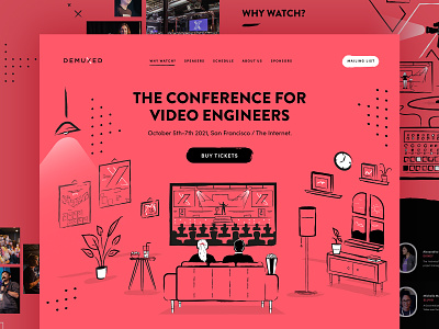
For the 6th year running I worked again with the amazing people at Demuxed on the 2021 version of their conference site.
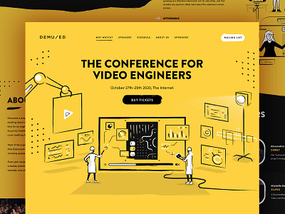
We reuse the same look and feel over a two year cycle, updating main accent colours, illustration and the conference details to get full milage from the design. Next year will be a fresh direction, like in previous years where we work on a new a brand new visual theme.
This year I worked on new illustration to highlight the 'hybrid' nature of the conference, being partly an in person and partly online event -- unfortunately Covid meant in the end it was 100% online this year. The other main change was updating the main accent colour to a striking coral, which was a nice contrast to the previous year's bright yellow.
Already looking forward to next year. :)


