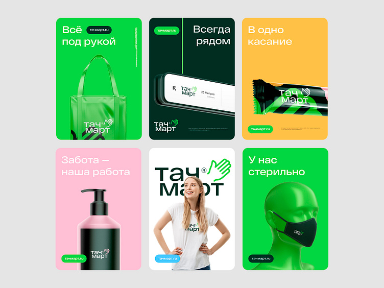
Touchmart — logo, naming, identity.
Touchmart ©
Naming and visual identity for a network of grocery stores in subway crossings. Touchmart has 60+ points throughout Moscow.
Traffic, contacts, time, dynamics and availability.
The new philosophy reflects a modern, friendly approach —a quick purchase in "one touch". A tangible brand with a clear name.
Updated values are close to the consumer — speed, mobility and convenience. The shops are literally "at hand". A pre-selected assortment allows you to save time,
make a quick purchase — this is especially important for large megacities residents.
A comprehensive solution and visual communication help to convey new meanings and values to the consumer.
Handshake as a daily symbol
For the first sight, it is an elementary gesture and formal, but still playing an important role in our daily routine. A handshake conveys the brand's interest in a person — where everyone will find their reflection.
The hand welcomes and disposes, shows warm, friendly intentions.
