PlugShare App Redesign
💌 Have a project idea? We are available for new projects info@ronasit.com | Telegram | WhatsApp | Facebook | Linkedin | Website
Electrocars are no longer a futuristic concept but a real option for drivers in some countries! We're excited about this upcoming green change and got inspired by an electric car charging finder app, PlugShare. Here's our redesign of this mobile app.
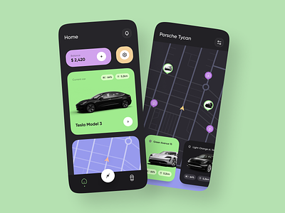
The shot shows two screens: a home page with the user's balance and car details and battery. The second screen shows a map with the user's cars and the nearest available charging stations.
We wanted to add a more techy and futuristic look to the app by selecting a dark background with bright, neon-like colors for interface elements. This color combination uplifts the design making it look modern and trendy.
This concept aims to redesign the existing app in order to optimize the screen space, make it more user-friendly and eye-catching. With the new color palette and content restructure, this app will be even more attractive to its users!


