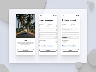
Sign Up Mobile User Interface
What makes a good Sign up form, or a form in general?
Is it better to have a multipage experience, or is it better to curate the necessary input fields and have everything in one place? I think the latter creates a better User experience; the reason is that every time I'm faced with a multipage sign-up flow, I immediately think of taking a survey and although I really love my surveys, I find myself hard pressed to believe that most individuals find the experience particularly pleasurable. Thats not to say that there isn't a place for multipage forms however in this particular flow I think it makes sense.
The above design focuses mostly on Accessibility, Click optimizations and Clear visual communication to create simple easy experience, with out the use of SSO.
This was created with Figma.
