Daily UI 043 - Food/Drink Menu
Challenge 043: [no description was given]
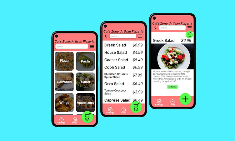
I thought the layout I produced in yesterday's project would work well with today's menu challenge. For this challenge, I imagined making an ordering app for an artisan pizzeria. Much like my ToDo List challenge yesterday, the first screen has a layout with general app navigation options at the top and bottom of the screen. I made this cart button significantly larger than the settings and home buttons since I want to draw users' attention towards finishing their purchase.
For the right-most screen, the food description screen, the call to action button instead becomes the add to cart button. It's color and placement help make it feel intuitive that that button corresponds with the cart button from previous screens, therefore leading users to easily interpret that it is the add to cart button.
My thought process for the general layout of all screens can also be found in the ToDo List challenge from yesterday.
This prototype was made in Framer.
