Practice brief: wine label for Peruvian malbec
Practice brief from Briefbox.
Brief:
Design a wine label for Peruvian based malbec wine producer, Tipsy Llama. Tipsy Llama would like you to include some Peruvian style in your design, ideally with a llama present but it doesn’t need to be the main focus. Limit your colour palette to a maximum of 5 colours. If you want to push this quick challenge further, explore presenting the artwork mocked up on a wine bottle.
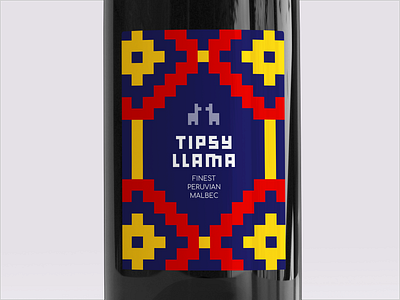
The first design (pictures one and two) is my favourite. I used the font 'Bulky Pixels' because I thought it nicely complemented the geometric forms found in a lot of Peruvian patterns, many of which are made up of squares. I used minimal icon-style llamas. The star of the show in this is the brightly coloured patterns -- in a saturated market of wine, you want something that will make you stand out in a supermarket setting. The bright colours and bold pattern would do that, and I think the boldness is also a nod to the wine type.
The second design (pictures three and four) was my 'wild card'. I thought I would base the design on a photo of a wonderfully sassy llama I found from Paul Fuentes and flip it upside down to achieve the 'tipsy' reference. I incorporated the geometric Peruvian patterns around the side, but this time as the secondary element of the design, with the upside-down llama featuring as the primary component. I extended the light blue background of the picture to fit the whole label; while it's not a colour you'd traditionally associate with Peru, I don't think this matters given the other elements provide that reference.
The third and fourth designs (pictures five and six... sorry, that's confusing!) were other variations I made. I like them, but not as much as the first two designs. They were just me riffing off the first design and seeing what else I could come up with.
Let me know which your favourite is!


