Purchases
This was the last of the empty-screen icons. Visible on the purchases/voucher list if there are not yet purchases.
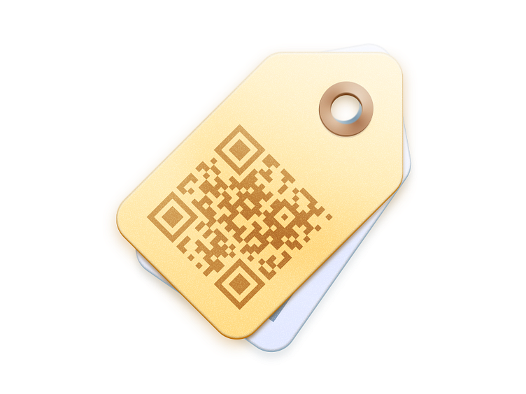
More thought went into this one than the rest. First off, we're already using the tag icon in the app's navigation, for this same screen. On that screen/list, "redeemed" deals display chronologically at the bottom of the list, with a black and white merchant photo and gray text. "Unredeemed" deals display at the list's top, chronologically, with the color photo and not-b/w text. Compare to the all-nearly-gray tag beneath the top tan tag. Furthermore, the vouchers are a single screen with a QR code taking over half the screen; the only text is the voucher value and redemption instructions.
Props to @Jono for an old tags icon he did; original source of the idea.
Also, scan the code. View the 2X.