Daily UI 042 - ToDo List
Challenge 042: [no description was given]
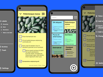
I wanted to emulate Google Keep Note's interface; granting a more streamlined experience. I chose to keep a lot of the same UI elements: sticky notes in the center; search bar and menu at the top; and a "new note" button at the bottom.
The main issues I've found with Google Keep Note stem from how busy its screens are. On just its main screen as of the time I'm writing this, there are five buttons at the just bottom of the screen. At the top of the screen, there is a hamburger menu, a toggle button that doesn't give much info to the user (unless the user is thoroughly experienced with the app); and a profile button. This is all without counting the notes and to do lists in the center of the screen. Individual notes are given space based on how large the note itself is. This can easily mean that one large note takes up the entire screen - and that's only when its being previewed, not opened. All of this together results in a messy screen that can easily overwhelm users, new and experienced.
For my prototype, I chose to include the same elements while still allowing items to breathe. Sticky notes are spaced out into a two column layout. Larger notes are given ellipses to show that there is more to the note than its preview. This allows the user to view as many notes as they have made as possible, while still providing enough detail to distinguish one note from another. All elements that are not immediately required for most user journeys are placed in the settings menu via the hamburger icons in the top right of the screens.
I'm considering going more in depth with a review of Google Keep Note's UI and its poor user experience if I ever have the time. Let me know if I should!
This prototype was made in Framer.