Hopstr • app design part 5
Hey dribbblers 👋
5th part of Hopstr app, following the previous part! This app will become a UI kit, more designs are coming soon 💪 And if you're curious, check out the first Behance presentation of the projet!
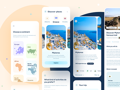
This time I created the user flow to discover destinations around the world, find experiences/activities there and get inspiration on where to travel.
🔥If you like this project, follow me to stay tuned & see the next designs ! 🤓
Typefaces : Nexa Bold, Museo Sans
***
Feel free to drop any feedbacks, I'd love to hear it! If you want to support me, press L to like 💜
Cheers for checking and have an amazing day! 👋
***
More by White Label View profile
Like


