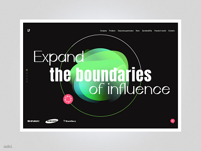
The E - commerce landing page design concept
📬 Do you have new project ideas? Our team is available for new endeavors: hello@adcillc.com
Hi friends, 👋 today we want to tell you about The E-commerce landing page design concept.
✔️ A dynamic concept that speaks of innovation and modern technology. The central figure reminds us of a talking assistant and that with the help of the voice we can control household appliances — figuratively, standing guard over technology.
🍀 The font goes beyond the circle because the company also wants to go beyond borders and language barriers with the help of technology: with this metaphor, we illustrate the multilingualism of the site, showing the desire to find new investors, to «go beyond».
🔎 Users can quickly make an order on the site and get more information about the product with the help of this landing page.
🎉 Tools used for the design: Figma.
Get inspired by the work 😍, click the «Like» ❤️ button and subscribe to our updates so you don't miss anything.
🌎 Follow us:
Website | Instagram | Instagram Russia | Behance | Facebook | Dribbble
