ClickUp Case Study
Welcome to my ClickUp Case Study!
Step 1 — Goal
The goal of this case study is to evaluate the website ClickUp and see if I can find any improvements I would recommend to the platform. I'm looking for areas that would improve the customer's experience while still staying true to the fundamentals for power users of the platform.
Step 2 — Research & Review
I reviewed various ClickUp pages to get more familiar with their designs and see what might need improvement. I was very impressed with their designs and it was difficult to find any flaws or areas of improvement. After reviewing them, I decided to work on the "Comments & Chat" page.
Step 3 — Wireframes
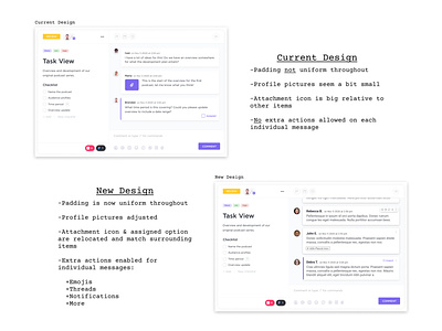
I started wireframing the current design to see what the layout was like. I also constructed the current design's padding for the page and noticed that the padding wasn't uniform throughout the design. I also found items that seemed either too big or too small for the environment. I wanted to tweak the design to resolve these concerns.
Step 4 — Exploration
From my research and wireframing, I narrowed down the most important items to update:
+Create a more uniform padding/margin using the 8-point grid system
+Enlarge profile pictures
+Reduce and relocate the attachment icon and the assigned button
+Create actions for individual messages (emojis, threads, notifications, etc.)
Step 5 — Design
Now that I know the goals for this project, I started drawing up wireframes and new padding for the updated design. I would reflect on my goals throughout the process and make sure the key features of the page were still there.
Step 6 — Presentation
After iterating on the design multiple times, I came to a design that I was satisfied with. I think ClickUp would also benefit from these changes and that's the reason for this case study. I packaged all my work up into the images you see above and made sure my Figma file was organized.
Conclusion —
I really enjoyed doing this project and I hope you have enjoyed reading through this case study. If you would like to review the Figma file I used for this project, check it out here! Thanks!
Image Source:


