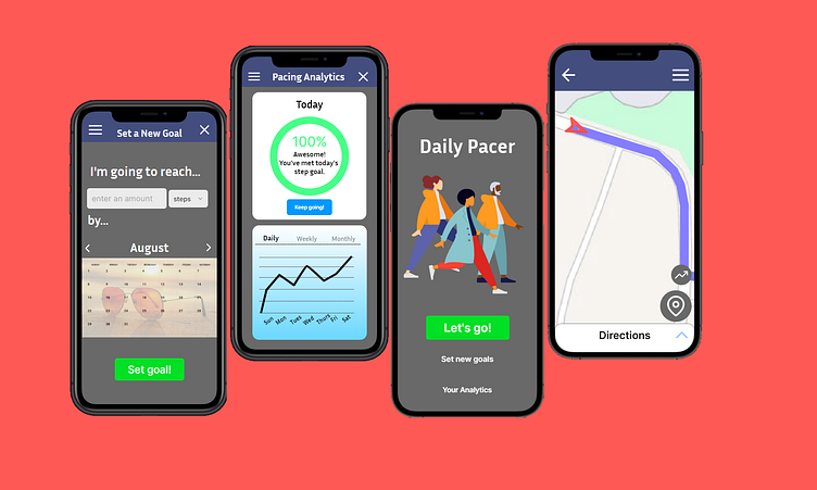
Daily UI 041 - Workout Tracker
Challenge 041: Create a UI related to monitoring health or tracking various workout/training routines. It could be for a personal workout, for a team, or even gym equipment tracking someone's workouts.
I realized I did this for a different challenge already, so I wanted to improve on it for today. Based on what I've learned since then, I had a few things in mind that I wanted to change.
My first goal was to increase contrast for legibility. In the previous version, I was trying out gradient background, going from blue to white / white to blue. While that can look nice on some screens, it can become more difficult for the user to easily understand what's going on on screen. So, I switched to a dark gray background with bold white text for titles.
My goal was to increase navigation options for the user. For this, I added icons and buttons to the map screen, the main screen, and the Pacing Analytics screen. I also provided an option for users to set their own goals, and made it was accessible for users from other screens with these new navigation tools.
My third and final goal was to have only one call to action button per screen at most. This helps give emphasis to the one call to action, avoiding the chances of misleading the user in achieving their goal. The main screen's call to action button remains the "Lets go!" button, getting the user to start running; the main purpose of the app. Other buttons on the main screen are beneath it: "Set new goals" and "Your Analytics" buttons are still relevant, but not as important.
Any and all other design decisions can be seen in previous challenges. Namely, day 20 and day 18.
This prototype was made in Framer.
