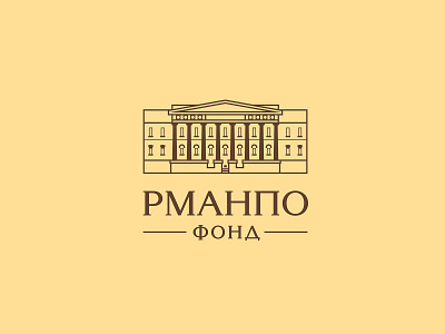
Logo design RMANPO Fund
About the fund
The Foundation of the Russian Medical Academy of Continuing Professional Education (RMANPO) is the largest scientific and methodological center for training healthcare professionals. The activities of the academy are aimed at improving the quality and reducing the cost of medical care, developing modern approaches to treatment, prevention and diagnosis of diseases. Additional and postgraduate education programs are carried out on the basis of professional standards.
Task
The creative agency Bramar was tasked with creating a company logo for the RMANPO fund, while preserving the universality of the sign, form a branding strategy, сhoose colors and typefaces that reflect the specifics of the academy.
Completed work
Performing the redesign of the logo for "RMANPO" we saved the historicity, traditions and the structure of the fund formed by the specifics of the activities. The image of the academy building served as the basis. The design turned out to be simple and dynamic - it contains elements of the corporate identity of the founder's logo as a link between organizations.
The result
As a result of the design the company's logo was formed a unified concept from the image of the academy building and the font block consisting of the descriptor "ФОНД" and the abbreviation "РМАНПО". Through static, rectangular and horizontal composition, the design symbolizes the stability and reliability of the organization.
Thanks for watching!
Project: Logo developed by the RMANPO Foundation
Bramar creative agency
