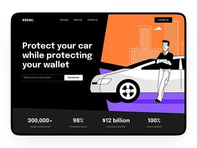
Car insurance website
Hey Dribbblers, how is everyone doing?
Have you noticed that most of the car insurance websites look quite corporate? We thought about why car insurance can’t be fun and attractive. In the designs that we suggested to the client, this option was a winner 🏆
Here is the recipe: a bunch of bold colours, a bit of big letters, and a handful of stroke illustrations - everything together forms a unique and untypical for insurance agency design.
How do you feel about it? Do you think it’s relevant to offer such solutions for insurance-related companies?
Let us know in the comments.
Learn more about our processes and capabilities at hbtat.agency.
✉️Drop us a few lines at hello@hbtat.agency
***
More by Habitat View profile
Services by Habitat
Like

