Exam platform
Hello Dribbblers,
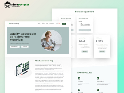
I created a landing page design for an online exam platform. I try to make it clean by using white space.
Please share your feedback about the color choice and placement of the elements.
If you like what you see, don't forget the press the ❤️ icon and follow me.
More by Nima Designer View profile
Like
