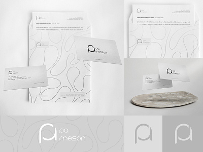
PA Minimal Boutique Branding & Monogram Logo
PA was a women’s boutique with minimalism being at the core of its products, packaging and store theme. Since they had light grey as their primary colour pallet and were looking for a logo remake, we knew we had to think about a grey-ish minimalistic logo that could seamlessly bond with the boutique.
Since their name came from the owners’ initials, logotype became our number one suggestion that was ultimately approved by the client. Numerous sketches were produced by our team, and after a couple of minor tweaks, we reached a consensus with the client on the logo that you are looking at right now.
We had also been asked to design other marketing materials such as business cards, letterheads, envelopes and packaging, which were taken care of with respect to the minimalistic theme and the main colour pallet.
See full project on behance CLICK HERE
I'm looking forward to working on your project,
Feel free to contact me for service related queries before placing an order!
Thanks for watching!
