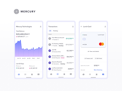
Mercury Android App
As soon as we launched Mercury for iOS, we began getting requests for an Android app. Recently, I was able to work on making these requests a reality. I partnered with the amazingly talented Tad Fisher (our Android engineer) to build Mercury for Android from the ground up.
Design Systems and Android
When designing and building the app, we wanted to ensure we stay true to the Android platform while still making it feel like Mercury. Our color system, typography, shadows, and interaction patterns in our iOS and web apps were completely rethought and redesigned for Android. Using the Google Material guidelines, we built a new design system from the ground up to allow for super fast future updates and feature releases.
The App
For the first release, we pared down the app to its most crucial features. Checking your balances on the go, taking quick card actions, and reviewing transactions. This limited scope allowed us to build and ship the app from scratch in around four months.
As always, give us a shout if you have any thoughts or feedback!
Matt Wright


