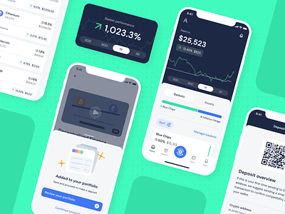
Makara — Cryptocurrency robo-advisor App
Hi Dribbblers! 🤗
Happy to share with you one of the latest designs I created with Z1: the UI for Makara, a company that believes cryptocurrencies should be accessible to everyone.
Makara uses advanced algorithms to build and manage crypto portfolios that are specifically tuned to each investor's goals and preferences. Investors who are interested in this blooming sector, but who don’t have all the necessary information to enter the complex and constantly evolving world of cryptocurrencies.
When Makara founders arrived at Z1, they already had a cool color palette and brand identity raised. Our job was first to understand their vision of the project and the product itself. We hold several weekly meetings with their team members, a ping pong game of continuous iteration in which not only was the client included, but also the future users. We walked on the shoes of these users traveling the path they'd follow when entering the app. We had to proceed as simply as possible, committed to offer confidence for a user who is about to enter a world still unknown. We wanted to lead the users by their hands towards investment plans according to their needs.
We achieved this goal by taking great care in the onboarding flow, based on illustrations and motion designs to ensure clarity. We bet on friendliness and simplicity and we played with the negative on some screens to give it more visual dynamism. All in keeping with the values of Makara, whose merit is in clearing the clouds of this complex crypto-world.
