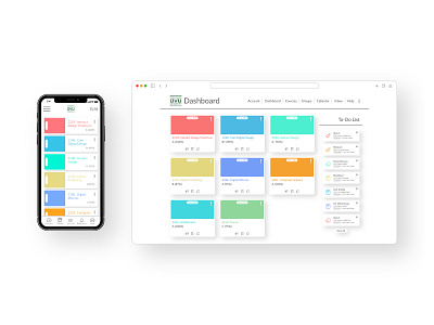
Canvas Redesign Concept
Case Study Brief —
This was a fun school project. We were trying to take the LMS (Learning Management System) and redesign it while keeping the main functionality and features. I crafted this project in Adobe XD, Photoshop, and Illustrator.
Step 1 — Research
I used to work for the Instructure who owns Canvas as their L1 Support agent, so I was very familiar with the interface and I had a lot of ideas for what I wanted to do with it. I looked for inspiration on a variety of websites and wanted to go with a 3D card effect.
Step 2 — Sketches
Started with some sketches to see what would work best for the screen's real estate and functionality for the end user. The focus started with the dashboard and how the course cards would be presented to the student. Even the strange options lead to better design.
Step 3 — Wireframes
I transitioned my sketches to Adobe XD and started to see what my designs could become. I also built out some options for an assignment page, grades page, and modules page. While focusing on the end-user experience, I was able to adjust Canvas to their needs.
Step 4 — Surface Comps
My designs started to take shape and I included content into the design to see what it would really look like. I adjusted my designs through user testing and feedback. More sketches, wireframes, and revisions.
Final Submission —
After adding color and finalizing the designs, I am successfully finished with my Canvas Redesign Concept. I was extremely happy with how it turned out and it's the project I'm most proud of. I love talking about this project and explaining the different design choices I made. My experience working for Instructure has lead me to make a lot of these choices because I work directly with the client everyday. I definitely learned a lot in this project and really enjoyed making it. I have more ideas for improving the design and I plan on including the progress here on my website. Thank you for reviewing this project!


