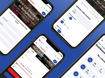
Design for multi-vendor marketplace - mobile app
When working on this multi-vendor vehicle marketplace, we made the mobile version our top priority. It’s very convenient when you can open a website or an app from your mobile phone and choose a car with a couple of clicks (or quickly sell yours).
Here is some design advice for great user experience on a mobile app:
1) Easy navigation. Place the main elements in the header (these could be your contact phone number, search button, sell or buy button, social icons - it all depends on your niche and target audience). As for such important pages as Dashboard and Profile, you can place them at the bottom of the screen, this way users can easily access them anytime.
2) Simple web forms. Break a web form into several stages, use dropdown lists with autofill. Suggest users to save the data they enter.
3) Clear layout. Don’t put everything in one place, or users won’t be able to click the necessary button when they access your marketplace from a mobile phone. Make sure that all the buttons, icons, text fields and other elements have free space around them.
If you need help with marketplace development, we would love to discuss your project. Let’s get in touch!
Don't forget to visit Codica’s website for more case studies.
Follow us on socials:
