City Communal Cervice logo
This is the second working version of the logo.
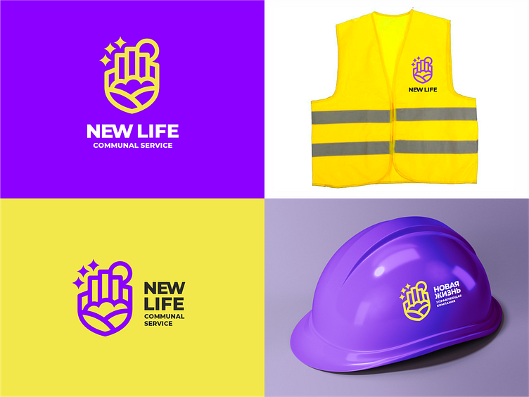
Let me remind you that the company provides services for the maintenance of residential buildings. The purpose of the logo is to convey a feeling of round-the-clock care and tranquility in all technical issues of city life. The original idea of the logo in combination of a hand or palm with the cityscape - buildings, trees and fields.
Since this is still a working version of the logo, I am still thinking about how best to arrange the elements and what color to choose.
Many of you have a lot of experience in design and your comments today can significantly affect the way the logo will become in the end. Please compare it with the previous version. Which is better? Are there any color recommendations?
You can read more about me and my work here:
<a href="https://www.behance.net/pechonkin_design" rel="nofollow noreferrer">Behance</a> | <a href="https://www.instagram.com/pechonkin.design/" rel="nofollow noreferrer">Instagram</a>
Quick link to contact me:
WhatsApp https://wa.me/+380932157763
E-mail v.pechenkin@gmail.com