iTao logo

iTao is a social platform where users can share their shopping experience.
Idea behind the name:
The Tao of me. ‘i’ in logo means me, ’Tao’ means Tao of fashion. Some visitors might know that ‘Tao’ means ‘Dao’ or ‘Tao’ is short for ‘Taobao.com’ now, but we hope to add new meaning to this word, so that one day ‘Tao’ means shop with great fun all over the world.
Idea behind the graphics:
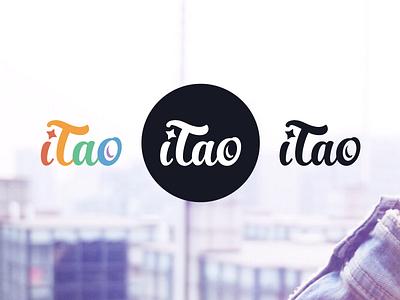
Fingers holding camera,
and the star in ‘i’ represents the flash when the photo is made. ‘o’ represents camera lens.
Colored logotype only uses soft Lomo colors, so that it can blend easily with not professional user photos made by phone with different filters.
之前看到这里了哟, 手指拿着相机, i的点像摄影闪光灯, o像相机的镜头