Morty's / Gritty
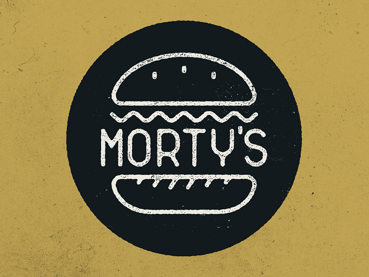
A second variation on the cafe logo. Grit applied and a slightly flatter looking bottom bun. Which looks better? What can be improved?
Initial thoughts / criticisms welcome.
A second variation on the cafe logo. Grit applied and a slightly flatter looking bottom bun. Which looks better? What can be improved?
Initial thoughts / criticisms welcome.