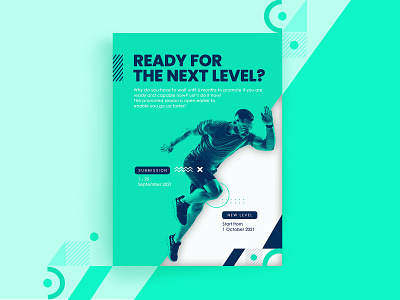
Poster duotone geometric design
Hola!
This is my exploration design about Poster that I made in Photoshop.
I tried to play with duotone colours mix with geometric elements for the accent, I arranged the Geometric elements like that to show up the movement (going up) to support the content (about promotion to the Higher Level)
Feel free to leave a comment and feedback :D Thanks!
More by Nindya View profile
Like
