REI Visual Merchandising Web App (02)
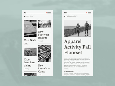
More exploration of layouts and styles. We removed the alert icon from the header bar and a simple red dot now indicates that there are messages waiting for the store employees. The homepage (latest post) is currently a stacked layout, but we are exploring a column approach to show more to the user.
More by Rareview® View profile
Like
