REI Visual Merchandising Web App (01)
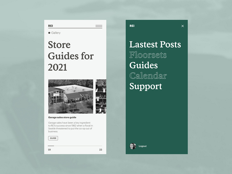
Visual exploration and refresh for our ongoing project with REI and their internal Web app. We're exploring the idea of using larger fonts, more whitespace, and an interesting header bar. We opted for text instead of their logo for several reasons, including simplicity. Additionally, we're exploring the third line of the hamburger menu being the header separator. We've removed several of the icons that exist in the header bar and are playing with a more simple alert notification system. The menu is also cleaned up and utilizes larger text to make it easier to use.