DesignKit for Figma
DesignKit for Figma is not another all done-for-you massive UI kit. My goal is to create a perfect, lightweight toolkit for designers. It’s meant to be used as your starter file that gives you all the creative freedom and flexibility you need.
Work Smarter. Design Better and Faster in Figma.
Get my complete DesignKit for Figma for only $99 with lifetime updates.
Here’s what’s new in October 2021 update:
🔥 More detailed instructions. Learn how to use DesignKit and the correct design process. There are new general instructions in the “How to” page, but you’ll also find more detailed step-by-step instructions on individual pages.
🔥 New file organization. DesignKit 1.3 got bigger! A lot bigger. I reorganized it completely, so now Colors, Typography and UI elements have their own pages. It should be much easier to navigate around and use it for both smaller and bigger design systems.
🔥 Updated wireframe examples. All sample wireframes have been updated to use new sections and to show how to use annotations and arrows.
🔥 Project handoff & presentation tools. Added new components with annotations, arrows, and section markers, so you can improve your project handoff and presentation. Annotations can be used to leave notes for developers or your clients when presenting your design projects. It’s easier to find those notes than regular Figma comments which should be used more for feedback and conversation.
🔥 Design exploration templates. Design exploration is the first phase of every design project. This is where you can collect all of your research, inspiration, and put together quick samples of the visual design ideas, so you can present and discuss it with your client. Added some templates for Research, Mood Board, and Style Tiles.
🔥 New Brand assets template. Brand assets now have a place not only for your logo and icon, but also for patterns, photos, and illustrations. Add more of your brand assets and turn them into master components, so you can reuse them later in the design.
🔥 Grid system. Added page templates with Layout Grids for different viewports. Still all sections are predesigned for desktop and mobile only, but it’s nice to have the grids better described and explained for different screen sizes. It can be helpful during the development phase.
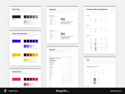
🔥 New Color Palette template. Your color palette will now look much better with these new templates. Added some new color styles and a Color Picker tool that can help find the right shade of your chosen colors.
🔥 New Typography template. Typography templates got a redesign too! It just looks much better and more professional now.
🔥 Completely redesigned UI elements. I started with small changes to buttons and I ended up redoing all buttons and input fields! They’re not much more flexible and have more pre-designed variants than before.
🔥 New wireframe sections. Added a whole bunch of new sections! Now you’ll have more options in choosing layouts for your wireframes.
👉 Get it here: DesignKit.us (only $99 for lifetime updates)


