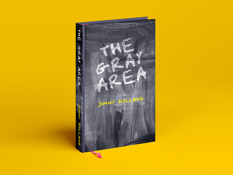
The Gray Area
The Gray Area
Concept book cover
This was a personal project for my portfolio. I wanted something minimal yet sophisticated as a cover. Gray and Yellow are always a good combination. The chalky texture was a design preference for a unified look and feel in the cover.
Please do like and share my work if you like it. Here are my freelancing profiles and social media handles. Have a great day!
Freelancer: https://www.freelancer.com/u/themirazrahman
Upwork: https://www.upwork.com/freelancers/~01e3fb06bb645b75d4
Fiverr: https://www.fiverr.com/themirazrahman
Facebook: https://www.facebook.com/themirazrahman.page
Instagram: https://www.instagram.com/themirazrahman
Twitter: https://twitter.com/themirazrahman
LinkedIn: https://www.linkedin.com/in/themirazrahman/
Behance: https://www.behance.net/themirazrahman
Dribbble: https://dribbble.com/themirazrahman
