Blog sections
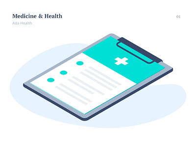
I am pleased to share the illustrations I did for Ada Health blog back in 2019! The main goal of this project was to keep #consistency within the blog, use all the Ada Health brand colors and try to show all objects lying on a horizontal surface (pure isometry).
The blog sections:
The initial shot is for the ‘Medicine & Health’ section.
The second shot was for ‘Business & industry’. The most challenging part was to stick to the briefing and draw a serious image using mainly shades of pink :D but it worked just fine, right?
The next one opened the section about ‘AI & technology’.
And the last one represents ‘Company & Culture'.
As the time has passed by, many things on their blog have changed, but if you're curious about this, you can still take a look at it (most of the illustrations have survived!) ✌️
https://ada.com/editorial/topics/medicine-and-health/


