Electrode manufactur logo and packaging rebranding.
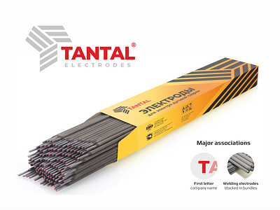
Here is a full-color version of the logo for the site and packaging of the electrode manufacturer "Tantalum".
The basic idea of the sign is a stack of electrodes folded in the shape of the letter T. This abstract and stylish shape scales well and is suitable for the electronic environment. Elements of the graphic sign look stylish and dynamic in the design of the package.
You can read more about me and my work here: <a https://www.behance.net/pechonkin_design
https://www.instagram.com/pechonkin.design/
Quick link to contact me:
WhatsApp https://wa.me/+380932157763
E-mail v.pechenkin@gmail.com