Personal Rebrand
Hola,
Originally I planned to make my previous logo responsive, but I ended up just changing the brand completely. It was time for a change.
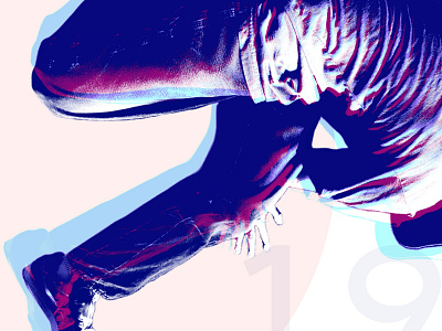
I want to be able to use design to improve our quality of life, so the goal for the new logo was to stick to my roots and adhere to accessibility standards. My original logo was a spider. The spider represented one of my passions, which is breakin. My friends would always say I looked like a spider when I would break. For the new logo, I decided to have the number 8 take the place of the spider. The style of the 8 comes from calligraffiti, but a toned-down version. I've always been a fan of blackletter because it brings me back to when would walk through my hometown in Mexico and all the shops would use that script on their signage.
