Branding for Chicago Botanic Garden (Learning Project)
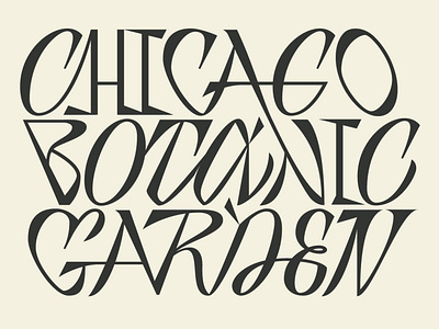

Logotype for the city garden. I had an idea to show here how strong and at the same time fragile our nature is. The logo has a structure of house of cards, which is reliable, but just because it is made of paper, it is unsteady.
I also wanted to give a hint of bizarre Carroll's world here. To show how fascinating the living world is, how beautiful and logical, but at times absurd and funny.