Delivery management platform redesign
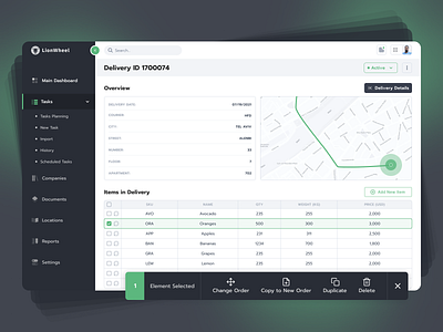
💻The main screen immediately displays the basic information about the order, as well as a card with a pin (similar to the current solution), but we hid more detailed information and its editing in a lightbox, in which the information is divided into 2 parts (General and Contact).
🙌This solution helps to separate information into logical blocks and make it easier to edit and read. Each element in the table has a message icon, this was done so that you could leave some notes on each of the items.
👀Make sure to subscribe to our social media:
Instagram | Behance | LinkedIn | Facebook
📮Have a project in mind? Drop us a line at hello@equal.design