Candidate
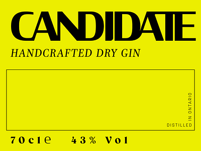
Candidate makes handcrafted, high end gin and needed branding and packaging that spoke to their sophisticated, contemporary and slightly edgy sensibilities.
The logo design is stately and refined with a random mix of hard edges and softer curves - notes that Gin often have. We extended this blending of elements throughout the look and feel of the brand. We went with bright colors and geometric shapes with fine lines, next to classic works of art in softer, floral tones.
Personally, I think this project was really cool. I love what we came up with.
More by Sam Tessendorf View profile
Like
