Organic Honey Packaging Design

Packaging design for organic honey "Пчелица".
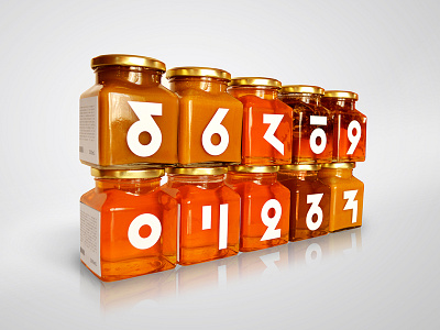
Education through design:
I added one more item to the design concept packing and that is the education of the young and old through design itself. As a matter of fact, there are few interesting hand-drawn illustrations on the labels, ranging from bee anatomy to its smallest body parts and neural network. The idea is that the design is not only used for marketing purpose but also for customer education through the illustrations on the back of the label. This idea is closely related to the numbering of each jar, which abstract numbers were specially designed for this project. Logo originated from the three ideas that symbolize honeycomb, the initial letter of the company (Cyrillic П) and stylizes flower shape.