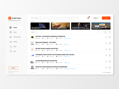
Website redesign | Hacker News | Concept
Hey fellow 👋
The redesign for The hacker news, after the redesign the UX gets clean and accurate, the user could easily understand the map of the website, and navigate without any problem. There were a significant amount of changes that make the experience of the website easier and understandable.
What do you think about the concept?🤔
Do you like this work and want to make something similar for your landing page/ website / mobile application? Get in touch with me - 🍀E-mail - a.boichuk.v@gmail.com
More by Andrii Boichuk View profile
Like

