Vocas - Logo Redesign Proposal ▶️
Vocas - Logo Redesign Proposal ▶️
Hello awesome people!
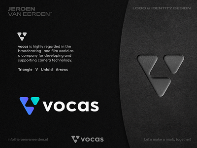
Today I’m finally sharing a new update on this amazing project called vocas. I wanted to find a mark that is bold and strong on its own, but also with enough meaning to last for years. In this specific concept, the idea was to focus on the letter V (abstract as a triangle), but also arrows and almost like there’s unfolding a piece from the puzzle into something unique. Almost feels like a rocket aiming forward/upwards which I think suits this business very well. They’re not only offering camera equipment but also develop their own products as true craft workers. This mark stands for moving forward and look ahead of its time.
BUSINESS INFO:
Vocas is highly regarded in the broadcasting- and film world as a company for developing and supporting camera technology.
I would love to hear your thoughts on this direction in the comments below. Have a great day everyone! ✨✌🏻
___
Want to work with me and create a mark, together? Feel free to reach out via my E-mail or Dribbble DM:
