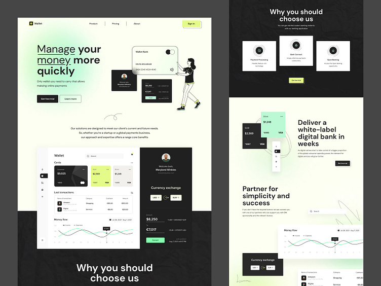
The wallet product page
Hey all,
SaaS landing product page sounds complicated, but the core sense behind it is the most valuable here. The clients’ approach is more about providing white-label technology to help start your own FinTech business. Or you can easily use it as a consumer for your own needs on a day; y basis. It’s all about you and your needs. My goal here was to create an understandable and intuitive design that would speak of the product. Modern and stylish design, my familiar style, makes this work look exactly in my art direction — a great combination of Colors and this slight gradient. How about my work with shapes? Oh, I like to merge simplicity and contract. How do you like this work?
If you are with me ==> Press “L” — give me some love. Your feedback is valuable.
Design — Figma
************
💌 I am open to new projects! hey@migulko.cz
************
