WhatsApp – Material Design – Part One
Hey! My first shot on dribbble! Yeah!
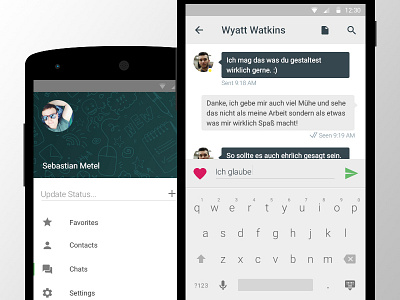
This is a redesign I am working on right now for WhatsApp. I took the new Google Material Design Guidelines and made my own version of WhatsApp which would fit the new style.
What you can see is the menu on the left (which slides out) and the conversation view on the right. There are different things to note about the conversation view: On the top you can go back, see the name, add an attachment or search through the conversation. You can put emoticons into your text by touching the little heart on the left. Also, the yellow dot next to the profile picture indicates the current status: Yellow would be online, grey would be offline. This is part one, so there will be more to see!
Thanks and I would appreciate come comments on how you like it or what could be better :3
PS: Some of the Icons are taken from Icon8! Check them out, they are awesome! http://icons8.com
