Biope - Ice Cream Logo
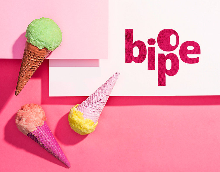
BIOPE
It is an ice cream dessert cart. The main purpose of this logo is to give a playable look to this business. Main target was to fill up the three targets with the logo. As it is an ice cream cart business the main target customers are children, teenagers and adults specially women.
Targets:
1. Logo must be colorful
2. It should be easy to read
3. Some characteristics or different
Logo is customized from Open Sans Extrabold typeface. To create uniqueness logo letters are disoriented in such a way that gives the logo a unique playable look.
Thank you for being awesome and appreciating the work. For business or project purpose contact me -
