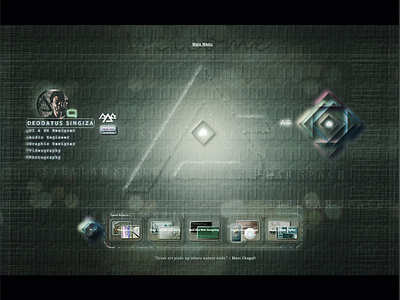
Stellar Space Website Design. Branding, logo design, neumorphic.
This type of gradient is a tiny bit extra for me but the background layer shows a bit better and you can see the flares of the street lights better in the bg jpg. the center logo outer glow is still not offensive to the other components around it. Any feedback is appreciated, thank you!
More by deodagee View profile
Like
