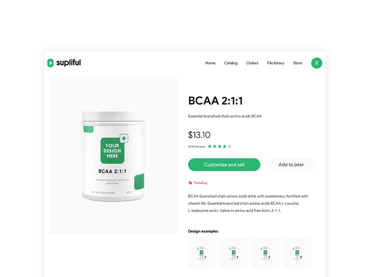
Product page
Happy Monday,
I am continuing to share with you Supliful designs.
In the shot, you can see the product page. Visual weight is distributed carefully between the left image and the CTA button on the right. The image remains fixed this allows users to scroll content on the right and at the same time the main product remains in the viewport.
You can learn more by visiting their website https://supliful.com/ Sharing with you our collaboration with Supliful team follow the link.
Please share your thoughts!
Take care,
Edijs
More by Edijs View profile
Like
