Camp.IT
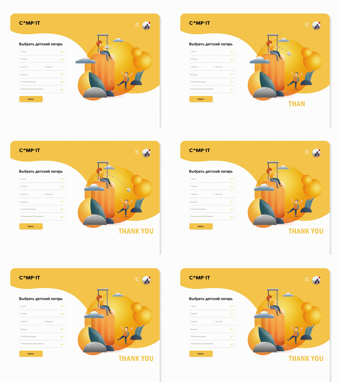
Camp.It is a marketplace and booking service for children's camps and education programs. A tool that connects parents who are looking for a camp for their child and the people who make those camps.
When it comes to summer camps, people usually associate them with fun, laugh, adventures... That's why we wanted the design of this website to radiate joy and lightness, to be vibrant and playful!
For that reason, we have chosen bright yellow and pure white to be the main colours of this design. This lively combination is beautifully complemented by fluffy airy shapes and trendy clean-cut fonts.
What do you think about this design?
For Camp-IT we created:
🔷 Brand visual identity (logo, color palette, fonts and typography)
🔷 Web-site design
=====================================================
Aranka is a marketing agency which specializes in contemporary channels of marketing communication focusing on brand's charisma.
We offer:
🔷 Integrated marketing (market analysis, communication strategy, media planning)
🔷 Branding (naming, logo, brand identity, positioning)
🔷 Design (packaging & souvenirs design, print marketing materials)
🔷 Social Media Marketing (Instagram, Facebook, TikTok)
=====================================================
Eager to work with us? Let's talk!
=====================================================
Follow us for more charismatic projects!
Instagram @aranka.agency
=====================================================
We will be thrilled to find out what you think about our work! ❤️
Feel free to share your thoughts on the comment section 😉
