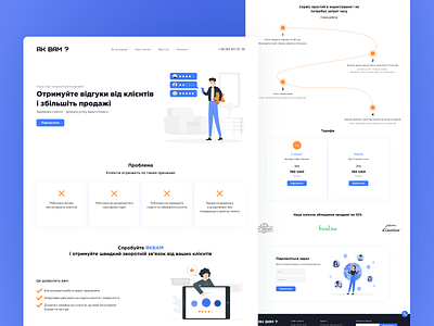
Landing page I ЯКВАМ
I had to make an alternative design for the banding and collate it in Tilde, but keep the content and text.
I decided to replace the illustrations with ones that better show the essence of the project.
I left the style clean and airy, but put more emphasis on that by increasing the indentation between blocks and elements of the site. I also changed the font to a similar one in the logo, and chose more saturated and contrasting colors.
https://www.behance.net/gallery/124932769/Landing-Page-I-jakvam
More by Slavik View profile
Like
