Learning Management System — Login Page

(1 / 3) Make Learning Looks Fun!
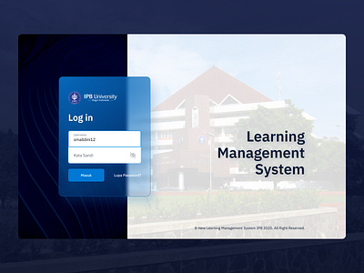
At the beginning of last year’s pandemic, I tried to explore the concept of redesigning the website that my college students visited the most during the pandemic, the Learning Management System.
From my point of view as a user for a year, when it comes to the user experience, it seems to me that there are many features that have similar functionality and some are not even used. Website content dominated by text, less vivid color, and relatively small font size are things that could be improved in terms of user experience.
Design Decision
☑️ First thing first, I came up with a solution to make the UI look like frosted glass (inspired by Microsoft’s Fluent Design System, it was a trend back then) with an acrylic material feel. So that it looks more cool and modern.
☑️ Some components that used to be text with hyperlinks (such as courses and PowerPoint files), I turned them into cards and then added colors according to the faculty or major to make them more legible and familiar.
☑️ For the User Experience, I made the design as simple as possible by cutting out the less important features, then put the important features into one section so that when you open the page, everything can be seen immediately and it’s easier to use.
Disclaimer : This redesign was not affiliated with IPB University and done on my own accord.
Got interesting project? Wanna discuss?
Really interested to work on unique digital product that tackles unique problems — Hit me up at naufanakbar@gmail.com🤙