Medical App
💌 Have a project idea? We are available for new projects
info@ronasit.com | Telegram | WhatsApp | Facebook | Linkedin | Website
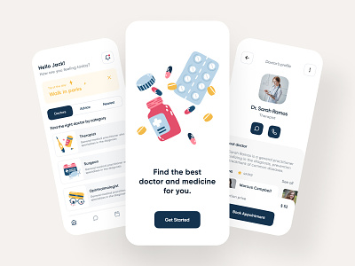
Today we're sharing our concept of a healthcare app that works as an aggregator of medical services: here one can book an appointment with a doctor, find the nearest hospital or pharmacy, and get advice from the healthy lifestyle blog.
The shot shows an onboarding screen in the center, a home page with a today tip, a bar for category search switching, and a doctor category list. The right screen shows a doctor's profile with their bio, rating, and patients' references.
We selected a neutral white background and red, yellow, and dark blue as accent colors. This color combination makes the app look simple yet not boring due to a range of accent colors in the interface elements.
This concept was designed to become a super app for healthcare that puts in one place everything that a user may want: advice from medical professionals, appointment booking, search for nearby hospitals and pharmacies.
What are your thoughts on this design?


