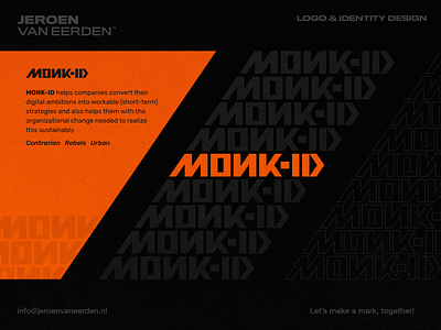
Monk-ID - Logo Wordmark Proposal
MONK-ID - Logo Concept Part 5. 🟠
MONK-ID helps companies convert their digital ambitions into workable (short-term) strategies and also helps them with the organizational change needed to realize this sustainably.
My goal here was to find something more typography and urban-focused. While using elements such as contrarian, rebels to make this a bit different and still unique looking as an identity. Tried to keep things 'compact' and potentially usable without the need for any minimal elements to be used as an icon. Still working hard to make this work and playing around with the use of this wordmark as an identity.
Currently open for feedback and to hear how you read this (as the N is mirrored to refer to being different and rebellion).
Thanks and have a great day!
___
Want to work with me and create a mark, together? Feel free to reach out via my E-mail or Dribbble DM:

