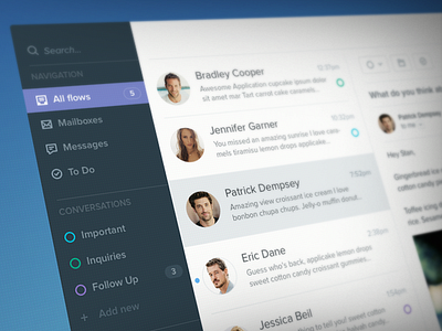
Messanger Application


It’s been a while since my last post here. Most of my projects are confidential and I can’t show them. I’m glad I got this one so I can share it with you guys.
I’ve created the original UI almost 2 years ago. The idea is simple - a single place to read all of your emails and messages and to create tasks based on them. Recently I was approached by the same client with request to try to simplify the UI. Not to redesign it, because he likes what he has, just to improve it. I thought this is impossible, it was done with simplicity in mind, how can I outdo myself? Sounds like a challenge, doesn’t it?
Here we go, a competition between present Me and Me 2 years ago. When I finish something, I like to play with the colors and the layout, that’s how I ended up with 2 versions to choose from. The third one is just for fun.
Let me know what you think, which version do you prefer?