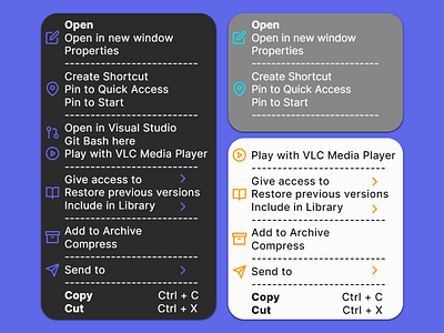
Daily UI 027 - Dropdown
Challenge 027: Design a dropdown element. Is it a menu dropdown? Or a tip that's dropped down during a tutorial?
I created a dropdown menu in a series of color schemes, black, gray, and white. I wanted to improve on Windows's dropdown menu by gently increasing the kerning and line spacing for better legibility and clarity. I also made sure to increase the amount of icons per section to better help the user differentiate the functions and options within each section.
While Microsoft's icons do this to an extent, there a few areas of improvement here. For one, drop down menus can still be messy and cluttered with the same icon for multiple settings; sometimes within the same section. Streamlining the dropdown menu to having few distinct icons per section reduces clutter while still providing the many, various options that dropdown menus showcase.
This prototype was made in Framer.
