Budgeting App with Glassmorphism
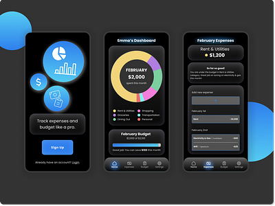
Glassmorphism effect: Played around with it to find that it's a sleek and "futuristic" UI style, but often not great for accessibility. I tried to consciously creating sharper borders, and work with larger (or thicker/bolder) fonts. Next time I would like to be more mindful of the color palette, padding, and blocks.
*Login / Sign Up page is just a draft - the vector icons are placeholders
